In the massive world of print and onscreen design, we rely on three main color systems: PMS (Pantone® Matching System), CMYK, and RGB/HEX. Any successful business knows the importance of having a complete brand guide that details logo usage, fonts, language, and the colors tied to their brand. Color plays a huge role in branding and keeping consistency across all platforms is crucial to any successful brand.
When creating a brand, we start by choosing PMS colors, but that’s just one piece of the process. In this article, we’ll help you understand color matching and what each color system is used for so you can better communicate with your designers and printers for the most consistent color possible.
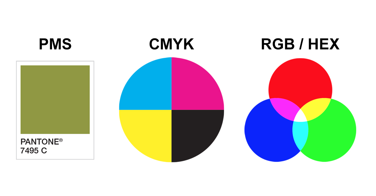
PMS
Pantone® is known worldwide as the standard language for color communication in the printing world. The Pantone® Formula Guide provides a full list of PMS colors and is used by both designers and printers to assure color accuracy. PMS colors are used for offset printing and are typically used for one or two-color print jobs, or in addition to CMYK on high-end print jobs.
CMYK
CMYK, used in the print world for full-color jobs, is also referred to as four-color process printing. A combination of four transparent ink colors (cyan, magenta, yellow, and black) are used to achieve a wide gamut of colors to create the appearance of full-color. If you were to look close at a CMYK print, you would see a combination of overlapping dots- where if you were to look closely at a PMS print, you would see solid color.
RGB & HEX
RGB is a color gamut of light using red, green, and blue to render colors onscreen. When designing for web, digital, or TV the RGB color system is used. HEX, which stands for Hexadecimal, is also used onscreen and is basically a short code for RGB color. A HEX color is a six-digit combination of letters and numbers. The first two numbers represent red, the middle two represent green, and the last two represent blue. In most programs the HEX number is automatically generated for you.
Color Matching Across All Systems
Within your brand guide, be sure to specify the PMS, CMYK, RGB, and HEX for each of your brand colors. In most cases, it’s best to start with the PMS color and convert it to CMYK, RGB, and HEX. To avoid color inconsistencies, I highly recommend using Pantone’s Color Bridge guides- which give you the CMYK, RGB, and HEX values to best match each Pantone color.
For instance, if you choose a bright vibrant orange Pantone color and then print it in CMYK, you may be surprised that your orange is not near as vibrant as the ink color you had chosen. Or if you create a digital ad in RGB and then want to place it in a brochure that is being offset printed, the bright vibrant color you see onscreen will appear muted once it’s printed in CMYK.
The Pantone Color Bridge guide allows you to view a side-by-side visual comparison of the Pantone color versus the closest CMYK process printing match on coated and uncoated paper. Furthermore, it lets you to choose a Pantone color that converts well to CMYK for the best color consistency across multiple platforms. If you don’t have access to a guide, programs like Photoshop & Illustrator will give these conversions for you. However, I have found the numbers to vary when converting within other programs to what Pantone recommends.
With this in mind, be sure to list all specific color breakdowns in your brand guide so that all users remain consistent in hitting your color targets. It’s very important that you look at each color in its final format to confirm the color is similar across all platforms- doing so will ensure your branding remains consistent.