If you are thinking of re-branding or creating a new logo, selecting the perfect color palette is one of the most impactful choices for your brand. Choosing the appropriate colors can emphasize your brand’s strengths and help attract the right customers.
Before deciding on a color scheme, think about the personality of your brand and the message you want your business to convey. Understanding tone of voice will allow your brand to stand out from the crowd. It is not just about what your company does or sells, but also who it is behind the scenes.
What’s your brand personality? Start by asking yourself these questions:
- Gender: Is my brand traditionally masculine or feminine?
- Tone: Is my brand playful or serious?
- Value: Is my brand luxurious or affordable?
- Time: Is my brand modern or classic?
- Age: Is my brand youthful or mature?
- Energy: Is my brand loud or subdued?
After you have a sense of your brand personality see which colors fit your industry. Research shows us that blue hues, for example, emphasize competence, while reds make you appear bold and energetic. Everyone has psychological ties to colors, and using colors strategically in your brand will have a serious impact on how your brand is perceived by your audience.
Color Emotion Guide:
RED:
Red is the color of passion and excitement. It’s the perfect choice if your brand is loud, youthful, and exciting.

ORANGE:
Orange is another high-energy color and is great if you want to appear friendly and playful. It’s used less commonly than red, allowing you to stand out from the crowd.

YELLOW:
Yellow, the color of sunshine, is all about happiness. The cheerful vibe makes it a good choice if your brand is fun, accessible and affordable.

GREEN:
An incredibly versatile color, green can be used for just about any brand. Culturally, when people see green, they think two things: money or nature. If your brand is tied to either of those things, green is an especially good choice.

BLUE:
The most universally appealing color in the spectrum. Blue can help your branding to appear more stable and trustworthy. If you’re looking to appeal to a wide demographic—and get them to trust you in the process—go with blue.

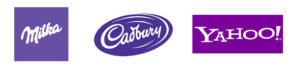
PURPLE:
Purple is the color of royalty, so if you’re going for a luxurious feel in your branding, this a safe bet.
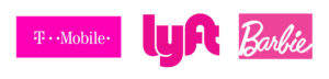
PINK:
Right or wrong, pink is culturally tied to femininity. So if your brand is targeted towards women, pink should be a definite contender for your brand color. It’s also a great color for brands with a soft or luxurious identity.
BROWN:
Brown is perhaps the least used color in all of branding, but that could actually work to your advantage. If you do something different, it will help you stand out. Brown will also help people view your brand as rugged or masculine.

BLACK:
If you want to be viewed as modern or sophisticated, there’s nothing as classic and effective as black.

It’s also important to see where your brand colors fit in your industry. Tech companies favor blue, retail leans on red, while green is typically found in agriculture. You can play it safe and join the crowd, or take a risk and do your own thing.
When it comes down to it, the best logo color for your business is the one that fits your brand’s personality. If it doesn’t feel right, it may be time redefine your brand and choose a color palette that speaks to who your brand looks and sounds like today.