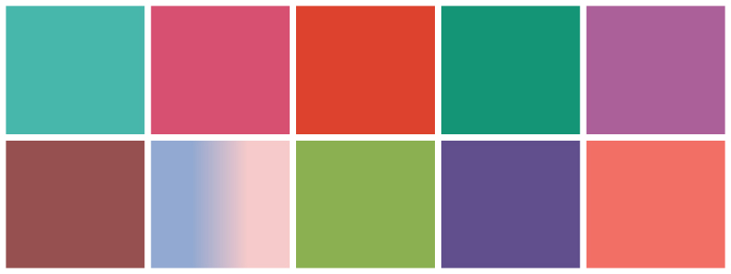
We were invited into the decade with Turquoise. The combination of serene blue and invigorating green inspired, comforted, and soothed while restoring our sense of well-being.
Courageous and confident, we rolled into 2011 with the brave, bold color of Honeysuckle.
Inspired by 2011, but more spirited, Tangerine Tango continued to give us a boost of energy to keep us moving forward.
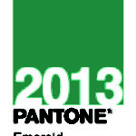
We took a moment in 2013 to enhance the feeling of prosperity, balance, and harmony with Elegant Emerald.
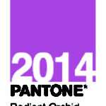
A bit of magic and imagination was sparked in 2014 with Radiant Orchid. Blooming with confidence, it was an expressive, creative, and embracing purple that emanated great joy, love, and health.
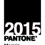
The middle of the decade, greeted us with the warmth and richness of Marsala. Naturally robust and earthy with its red-brown roots, it was sophisticated and had impact as both a grounded statement color on its own or a strong accent to other colors.
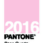
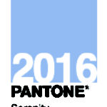
For the first time, Pantone introduced two colors that blended together for a softer take while seeking mindfulness. Rose Quartz and Serenity were symbolic of the changes taking place in our culture with societal movements toward gender equality and fluidity. Rose Quartz was persuasive yet gentle to convey compassion, while Serenity was weightless and airy bringing feelings of relaxation even in turbulent times.
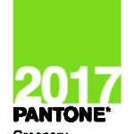
Springing into 2017 with a refreshing and revitalizing shade, Greenery was symbolic of new beginnings. The fresh, yellow-green shade evoked the first days of spring when nature’s greens revive, restore, and renew, reminding consumers to take a deep breathe and feel reinvigorated.
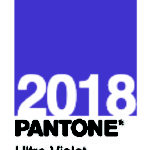
Ultra Violet lit the way in 2018 for what was yet to come. Dramatic and thoughtful, it pointed us to the future as we were intrigued by the discoveries that lay ahead. The night sky has always been symbolic and inspires the desire to pursue a world beyond our own.
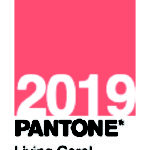
The final year of the decade embraced us with warmth and nourishment to provide comfort in our continually shifting environment. The vibrant, yet mellow, Living Coral is found in our natural surroundings and has a lively presence within social media, representing the fusion of modern life.
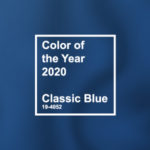 2020 Classic Blue
As one decade ends, another begins. We are excited to enter 2020 with the color Classic Blue. Timeless and enduring, it is elegant in its simplicity and brings us a sense of peace and tranquility.
Download the palettes by visiting Pantone. And if you’re interested in learning more about design, branding and color usage, click here https://rcpmarketing.com/category/design-branding/.