The biggest question in the web design industry at the end of every year is often, “What’s next?” 2020 brings trends that aren’t necessarily new, but are evolved and redefined in a way that can’t be ignored moving forward.
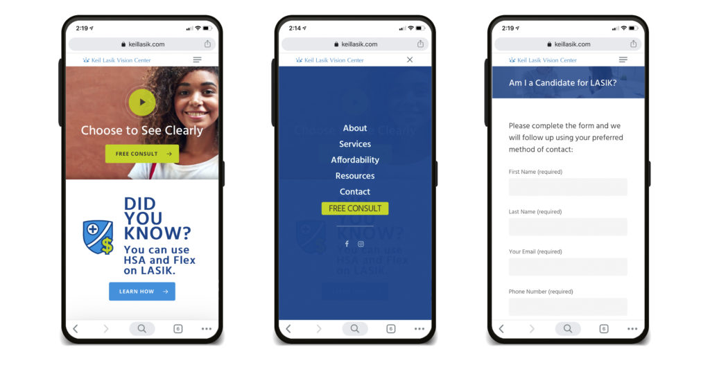
- Thumb-friendly mobile navigation
52% of all web traffic is now viewed through the lens of mobile devices. Minimalistic, thumb-friendly smartphone navigation and mobile menus will stay on-trend because responsive/mobile-friendly web design isn’t optional anymore. More than good UX now, Google has ranked mobile-friendly sites more favorably since 2018. This tells us that traditional website navigation could eventually give way to the mobile-thumb browsing generation.
- Load speed
With Google Lighthouse scores practically built into every browser, developers and end users have increasingly become obsessed with load speed. Studies on how people interact with different load speeds have found that 50% of users expect a site to load in two seconds or less when they click on a site. If it takes more than three seconds to load, they’ll leave. (And it’s not likely they’ll be back!). Another indication that 2020 will be the year of optimization for mobile.
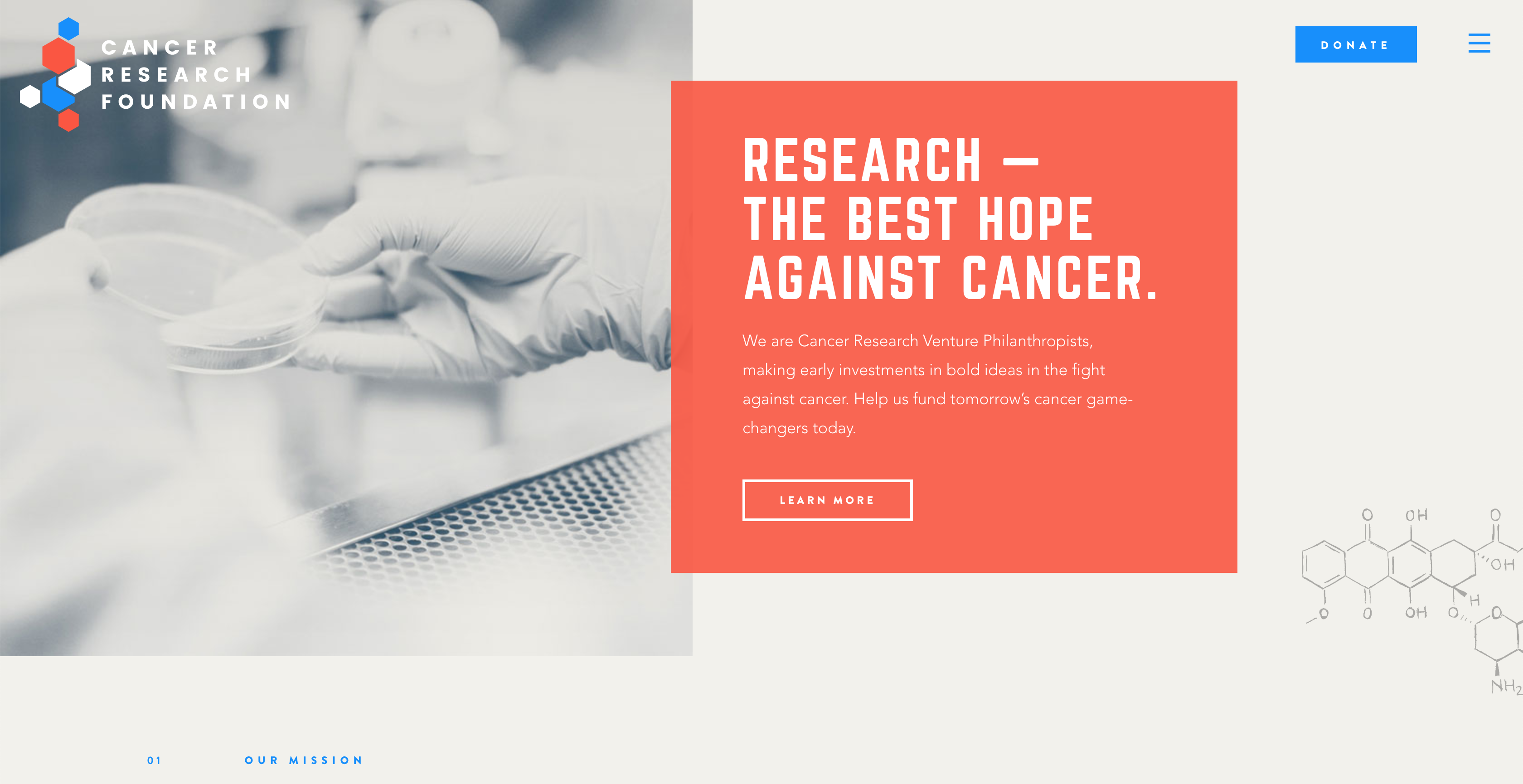
- Broken grid and asymmetrical layouts
Grid design is an imaginary plane with horizontal and vertical lines used laying out elements on a page or screen. With most websites, the grid is easy to point out — strips of content are boxed and move vertically down the page – and provide a framework for organizing UI elements on a page. When a website features a broken grid, items are pushed around on different planes in a way that makes the layout feel less linier, or broken. Instead of having a defined structure, an asymmetrical layout offers designers a chance think outside of the box(es) and experiment with the placement of logos and text – allowing for the imperfect to give a unique personality and, as such, is becoming more common on the web.
- White space
White space will finally shine again in all its glory as it’s predicted as a top 2020 web design trend. This will be driven by the rising demand for minimalistic mobile UXs (e.g., copy blocks, interactive elements, CTAs, etc.) that require more white space to help content stand out on the ever growing plethora of mobile screen sizes.
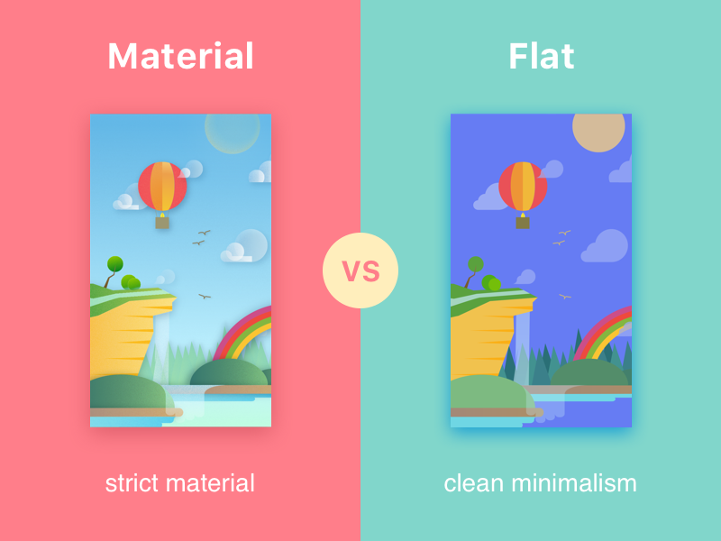
- The rise of smart minimalism
Flat design (and material design if you’re on the Google train) has typically been associated with the use of white space but designers and critics seem to have had enough of the boring boxes the past three years have brought us. That’s why we’re anticipating that designers will be experimenting with pushing interactive boundaries in 2020. Be on the lookout for a strategic mix of images, icons, and hidden navigation menus along with depth and subtle animations and CSS effects, while keeping the core value of flat design (i.e., white space) to engage their users.
- Vibrant and bold colors
The psychology of color and its impact on human behavior has been known to designers for a very long time. In 2020, we believe web designers will put even more focus on mindfully using color to evoke the mood(s) and feeling(s) a site is meant to elicit. Vibrant, saturated color schemes will continue to be the trend for some time.
- Chatbots
Chatbots will continue to gain popularity in 2020. As artificial intelligence and machine learning continue to become more sophisticated, we expect to see chatbots to be the norm for simple customer service requests. LiveChat, Skype, ZenDesk, Olark and others usage statistics continue to increase as users become more accustomed to their appearance on websites.
- The big and the beautiful
The use of bold, oversized, and stylized text and headlines seems to be here to stay. Through the use of CSS, Google Fonts, WebFonts, and Variable Fonts, beautiful and scalable typography is now accessible for web developers. Web text can be animated, decorated, and augmented. And, most developers have only scratched the surface of web typography.
- Video isn’t dead – it’s strategic
The power of video is not going away anytime soon. However, just after 2015, we saw a major push into making video a central part of web design. Then in 2018, Google had killed auto playing videos. IPS (and Google as well) penalized site speed and rank for too much bloated video content. No, this doesn’t mean video will not be dead in 2020. It will just need to be more strategic to the messaging and CTA of the page content. Embedding services like Wistia, Vimeo, and YouTube usage looks to keep going up and up as more video content is simply embedded content and less for animated site UI.
- Long live animation
Adding on to the last point, 2020 is trending to be the year most non-content related videos finally disappears from website UI design. With easy access to web animation tools, elements that were once videos (such as large moving backgrounds/hero videos) will be replaced by tiny CSS animations that do the same thing but can bring a playfulness or informative tone to websites.