In 1997, while I was busy working in a print shop somewhere in west Michigan and daydreaming about all things sci-fi and tech, a little start-up company called GoDaddy opened its doors. Three years later and fascinated by the new tools to develop for the web, I started my first GoDaddy account – the same account and customer number I have to this day.
At the time, GoDaddy was a quirky company offering all kinds of tools to easily host, betting against companies who were installing complicated servers in their back conference room closets.
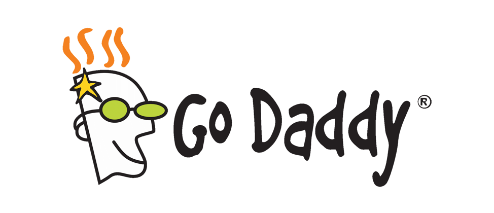
Their crazy logo and mascot quickly resonated with IT geeks and millions of people who were tired of looking at geocities style websites for years.
Fast forward to 2016 and the brand hadn’t changed in 19 years. The quirky ‘GoDaddy” brand was starting to be known as the balding grand-daddy who’s senile tactics where to micro-transaction every purchase to death.
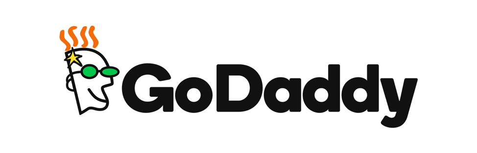
Then, halfway through 2016, the tech world started to notice UI changes to the GoDaddy home page. It was as if they started changing the underlying core technologies running the site. All the PNGs and Gifs started disappearing from the UI elements, being replaced by fast loading CSS and fluid AJAX menus. Then, in late 2016, the logo changed for the first time.
In context, the font change was smart. The original font hailed from the days where if you got an email written in comic sans & didn’t really think twice about it. But almost 20 years later, yeah, it had to go.
Microsoft, IBM, Apple, Google, DreamHost, MasterCard, Kodak, Mozilla, Subway, PayPal, Instagram, Facebook, HotMail, Yahoo, Netflix and many more updated their logos in 2016 to the simple, flat block type contrast on each company’s color of choice. Something that’s become known as brand “sameness”.
I’m not sure who coined that phrase, but I feel the simple “material movement” was starting to take off at the same time. Simplifying was starting to become the Jony Ive like drug of choice for graphic designers.
At least GoDaddy still had a quirky mascot next to their trendy new block font. It gave me a sense that the company still had some personality and fun, and that some suits higher up weren’t just changing to look like every other block font logo tech company out there.
Then in 2018 it happened.
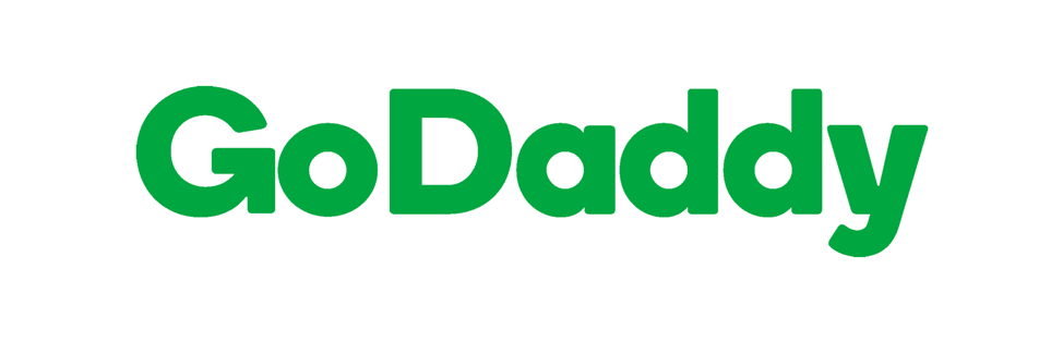
If you take a look at the GoDaddy website, other than the favicon and the about us pages, from product to checkout, the “Daddy” image we know and love is gone. Yet another tech company stripped of fun and designed into the sameness void.
Pitfall Of Chasing Trendy “Shiny Objects”
Culture is what makes a brands attractive. The right culture can make your brand, and the wrong culture (or perception of culture) can break it just as fast. Google, for example, has been the poster child for simple logo design and UI. You wont find shooting flames or optical marvels in any of their permanent branding. However, they contrast their simple branding and logo design by touting their internal culture of inclusiveness, fun, and employee respect. As other brands followed suit, we found what works for some doesn’t work for everyone.
Now this may be subjective, but when companies like Microsoft or MasterCard (who’ve been regarded as cold and uninviting) move to the sameness of simple flat logos, people naturally bucket them as corporate copycats. Yes, their logos are now more modern and easily recognizable, but they also re-enforce the perceived nature of those company’s cultures.
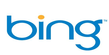
A great example of a brand trying to fit in but failing do so was Microsoft’s 2009 Bing logo experiment. Their pursuit of new and trendy (as defined by Google, Apple, Etc.) proved a failure, coming off mimicy and half baked.

The Thrill Is Gone… Or Did It Just Get The Sameness Treatment?
I understand companies grow and end up beholding to shareholder’s and board member’s opinions, but what happens when what sets you apart as fun and different gets swallowed up by trying to be like everyone else?
Some companies overprice their products (Apple), and some legally sell its user’s entire digital histories (Google) but still manage to continue to grow its user base. How? By adhering to their foundational culture – which, by extension, includes their branding.
My hopes for GoDaddy is that they don’t fully lose their sense of quirkiness and fun. In a way, I feel robbed when looking at their new logo; I feel like how I identified with their brand has been overlooked. As an active member of the GoDaddy culture, shouldn’t that mean something? Isn’t it the customer who ultimately guides a brand to success?
Brands who aren’t asking themselves these questions will feel disdain from their longstanding base and receive confused stares from newer brand adopters. Simply put, brands with longevity need to think less about what the fortune 500 are doing, and more about how their customers identify with their branding. Otherwise, their goal to stay hip becomes grandpa’s failed attempt at using phrases like “Lit”… and nobody wants that.